Addictionary
A seamless multilingual dictionary for Mac OS X
2011

Initial situation — Looking for translations when one is talking more than two languages can be frustrating: it often forces to make some back und forth between different dictionaries as the words that come to one's mind randomly come from the whole range of the languages that are practiced. Thanks to online dictionaries like Google Translate, the transitions have been improved but there is still room for improvement.
Approach — With the task to experiment the design of a simple software with standard GUI elements, we iteratively designed an interface reflecting the needs of two possible types of users: people with a bilingual education and pupils.
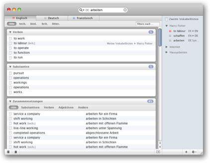
Result — We created a user interface concept practically removing the need of setting source and translation languages beforehand. It also seamlessly integrates monolingual dictionaries and enables the user to keep track and organize the encountered vocabulary
Process
- Market analysis
- Personas
- User scenarios
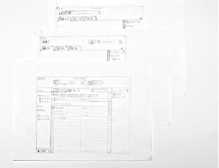
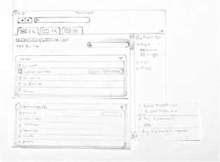
- Sketching
- Paper prototyping
- Wireframes
- Max OS X screen design
- Flash & Video prototyping
In collaboration with Gunnar Friedrich
–
Supervised by Timm Kekeritz and Frank Rausch at the University of Applied Sciences Potsdam, Germany


