Initial situation — Around the end of 2013, smartwatches were envisioned as devices that would extend the use of the most diverse smartphone apps while retaining the simplicity of a regular watch. Beyond this vision, the market was at its very beginning as devices like Apple Watch and the Android Wear had yet to appear and Pebble was in its first iteration.

Approach — In a two-step approach, we intended at first with the aid of cultural probes to understand the use of the “watch” as an object as well as its potential as a smart device. Later we designed a smartwatch based on the insights learned in the first phase.

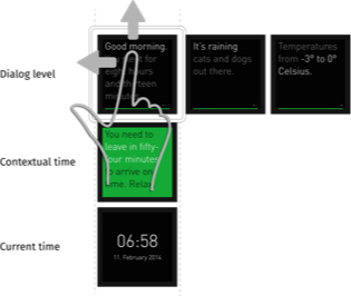
Result — We designed a companion smartwatch concept deriving from the insight that smartwatches would be mostly used in the context of a forthcoming event and that in those occasions, it may be helpful to translate the "absolute" time into some kind of "contextual" time.

Process

  • Market analysis
  • Cultural probes
  • Ideation & Sketching
  • Wireframes
  • Screen design
  • Video prototyping

In collaboration with Marc Heiland (Gabbo) as well as Luise Bergmann and Javiera Gómez (cultural probes)


Supervised by Prof. Matthias Krohn at the University of Applied Sciences Potsdam, Germany

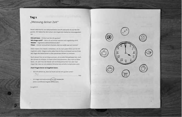
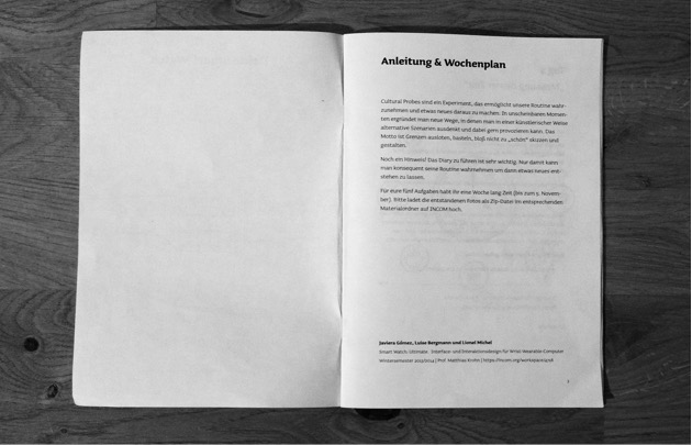
Cultural probes

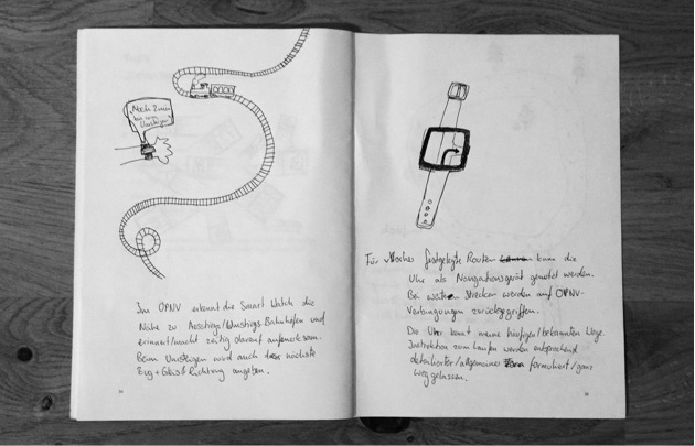
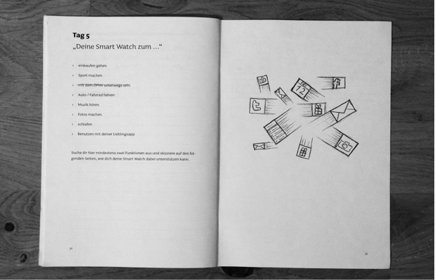
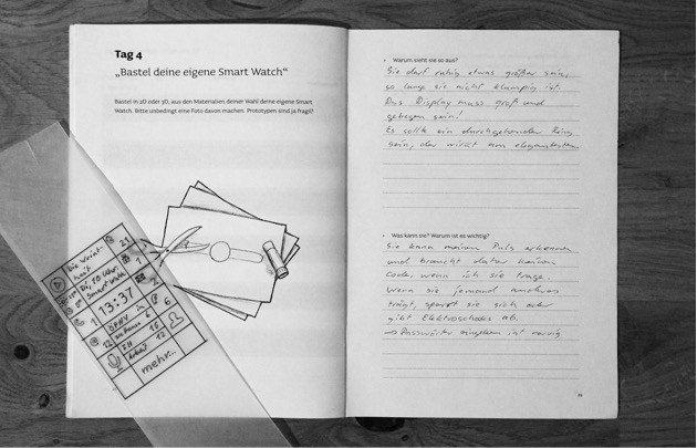
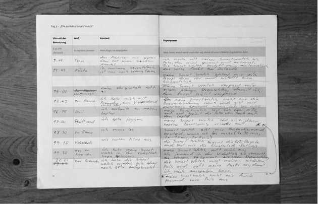
We explored with 10 participants the potential of smartwatches under various angles by concepting and providing a diary containing one task per day during 5 days. It included:

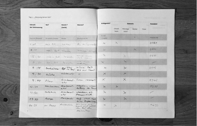
  • Track how often one looks at the clock
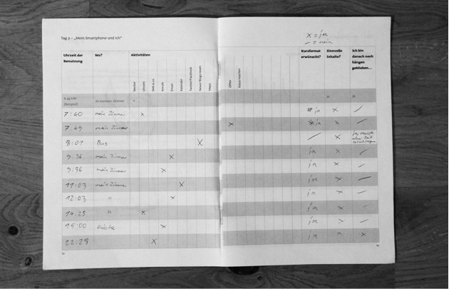
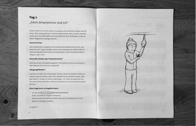
  • Track how often one uses her/his smartphone and for which purpose
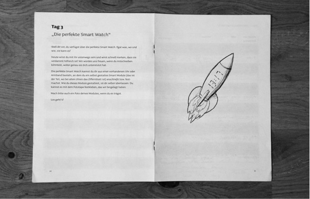
  • Track what a perfect fantasy smartwatch could do for her/him along the day
  • Design a personal smartwatch and explain it
  • Pick a preselected topic (public transportation, sport, music, etc.) and sketch a dedicated smartwatch

User interface concept

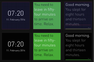
We designed a minimalist and typography-based companion smartwatch UI which provides the user with a flow of context-sensitive and personalized push-messages. Those are generated out of the context of the online services used and the geographical position of the user.
bla

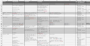
Systematic exploration of the content

The different kinds of content to be found within the various levels of the interface have been explored in a systematic way across the typical day of a user. This includes all kind of data to be generated by sensors installed in the smartwatch and its “master” smartphone.
bla

Visual design

The layout of the UI follows a grid.
bla